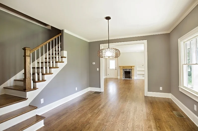
We love nothing more than building a unique home the matches our client’s individual style preferences, and this modern prairie home we designed in Edgewood is one of those unique homes.
Project Feature: Modern Farmhouse Masterpiece
Service Feature: Custom New Construction in Atlanta
COLOR CONSCIOUSNESS- Part Two
Green
Lighter greens establish a cheery and playful atmosphere. Deeper greens induce warmth and den-like elegance. Eco-consciousness color forecasters tag green as the new “it” color. But be sure to temper your green. A shade too dark and it becomes murky, too light and it ends up looking yellow. Strike the right balance and you’ll evoke a healthy homestead feeling ideal for a country home or forward-thinking urban setting.
Gray
We love gray because it’s dependable, sophisticated and soothing. Gray is also very versatile. It pairs well with white for a fresh look and black for a more modern one. Use dark gray shades like slate or cobalt for trim and an über-modern look. We love utilizing gray when highlighting architectural exteriors. Gray and crème is an elegant and classic color combination. Like blue, gray evokes inherent calmness and serenity. Gray is a wonderful backdrop for earth tones and wood. Gray does have a duplicitous nature though. Depending on how it’s used—it can warm you up or cool you down.
White
White is your get-out-of-jail-free card. You simply can’t go wrong with white. White is the color of purity, clarity, and rebirth. Of course, an overabundance of white can feel hospital-like. So treat your blank white canvas walls to paintings and framed pictures that best reflect your character. Create a “living gallery” of original artwork and photographs. White is the most popular color choice for home exteriors and can augment any interior space as well. Remember white comes in a multitude of hues—from Cottage White to Navajo Sand. Just because it’s popular doesn’t mean it has to be boring.
Brown
Brown creates feelings of warmth and security. Down-to-earth brown and its first cousins coffee and espresso are excellent accents for woods, rattans, and wicker. Window sashes of Victorian homes were often painted darker brown. As well, brown was a frequent flyer house color for Sears and Roebuck bungalow homes of the early 20th century. Use brown cautiously with interiors, too much brown can create a claustrophobic, cave-like feeling.
Thanks for reading!
COLOR CONSCIOUSNESS - Part One
COLOR CONSCIOUSNESS
The effects of color are often underestimated. We respond to color in both a conscious and an unconscious way. Color holds power. When there’s a house or architectural product that calls to us but we can’t put a finger on why—it’s likely the color. In fact, psychologists say over 50 percent of our initial reactions involve color. Now we even know which colors evoke which mood. Here’s a short primer for you to explore colors and the moods that they inspire:
Yellow
Yellow produces two opposing moods—happiness and anxiety. Initially, yellow produces joy and hope but if you’re surrounded by yellow for too long it may increase irritability. Because of this yellow may not be the color choice you room in which you spend enormous amount of time. Anxious yellow can be hushed by harmonizing it with other colors.
Purple
Like yellow, purple evokes bipolar moods of relaxation and stimulation. Purple is favored by creative-types because it stimulates the imagination and creativity. Purple works well in many space types. Day-dreamy purple is an excellent choice for an artist’s studio. Lavender has been a longstanding favorite color for little girls’ rooms and Tweeners. Elegant, regal purple is also a perfect choice for adult spaces. Purple hues like lilac and deep eggplant are becoming more and more popular city apartments and country homes with sophisticated interiors.
Red
Most of us know that the color red raises strong emotions. Though red is associated with feelings of love, comfort, and sometimes anger (“seeing red”)—overall it creates feelings of strong excitement and intensity. Red is the most dynamic color on the spectrum. Red’s intensity can be overwhelming at times so it may be best reserved as an accent color.
Blue
“Cool blue” has a reputation as a chill-out color for good reason. Above all colors, scientists have found that blue actually produces a calming physiological effect in humans. So, if you have a room reserved for lounging and relaxation consider a soft sky or Cloisonne Blue. Blue also works really well in small spaces, bedrooms, and hallways. Though it seems to be a psychological contrast, studies show that not only are people more relaxed in blue rooms they are also more productive. So blue may also be an ideal color choice for an office space.
More on colors and the feelings they evoke next week…


