Green
Lighter greens establish a cheery and playful atmosphere. Deeper greens induce warmth and den-like elegance. Eco-consciousness color forecasters tag green as the new “it” color. But be sure to temper your green. A shade too dark and it becomes murky, too light and it ends up looking yellow. Strike the right balance and you’ll evoke a healthy homestead feeling ideal for a country home or forward-thinking urban setting.
Gray
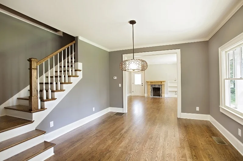
We love gray because it’s dependable, sophisticated and soothing. Gray is also very versatile. It pairs well with white for a fresh look and black for a more modern one. Use dark gray shades like slate or cobalt for trim and an über-modern look. We love utilizing gray when highlighting architectural exteriors. Gray and crème is an elegant and classic color combination. Like blue, gray evokes inherent calmness and serenity. Gray is a wonderful backdrop for earth tones and wood. Gray does have a duplicitous nature though. Depending on how it’s used—it can warm you up or cool you down.
White
White is your get-out-of-jail-free card. You simply can’t go wrong with white. White is the color of purity, clarity, and rebirth. Of course, an overabundance of white can feel hospital-like. So treat your blank white canvas walls to paintings and framed pictures that best reflect your character. Create a “living gallery” of original artwork and photographs. White is the most popular color choice for home exteriors and can augment any interior space as well. Remember white comes in a multitude of hues—from Cottage White to Navajo Sand. Just because it’s popular doesn’t mean it has to be boring.
Brown
Brown creates feelings of warmth and security. Down-to-earth brown and its first cousins coffee and espresso are excellent accents for woods, rattans, and wicker. Window sashes of Victorian homes were often painted darker brown. As well, brown was a frequent flyer house color for Sears and Roebuck bungalow homes of the early 20th century. Use brown cautiously with interiors, too much brown can create a claustrophobic, cave-like feeling.
Thanks for reading!


